CSS 플랙스(flex)
플렉스 개요
작성중
구성요소
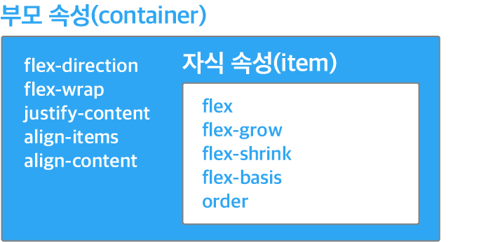
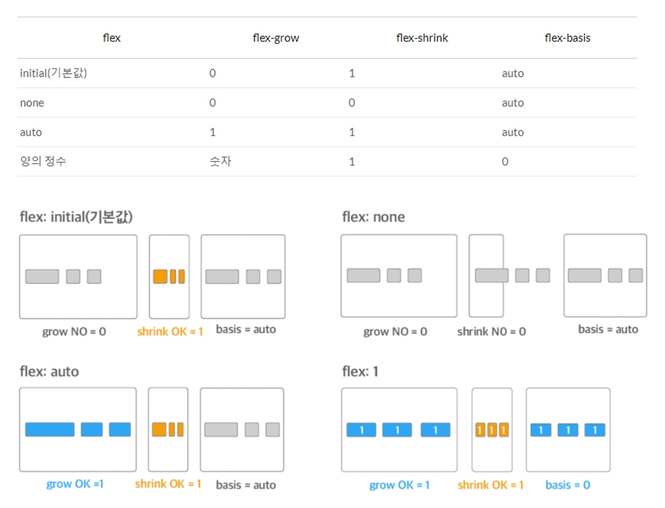
flex
-
- initial(기본값)
- flex container의 크기가 작아지면 flex item의 크기가 작아집니다. 하지만 flex container의 크기가 커져도 flex item의 크기는 커지지 않습니다.
-
- none
- flex item의 크기가 커지거나 작아지지 않습니다. flex container의 크기에 영향을 받지 않고, flex item의 원래 크기를 유지합니다.
-
- auto
- flex container의 크기에 맞추어 flex item의 크기가 커지거나 작아집니다.
-
- 숫자값
- flex container를 일정한 비율로 나눠 가지면서 flex container의 크기에 따라 flex item의 크기가 커지거나 작아집니다.
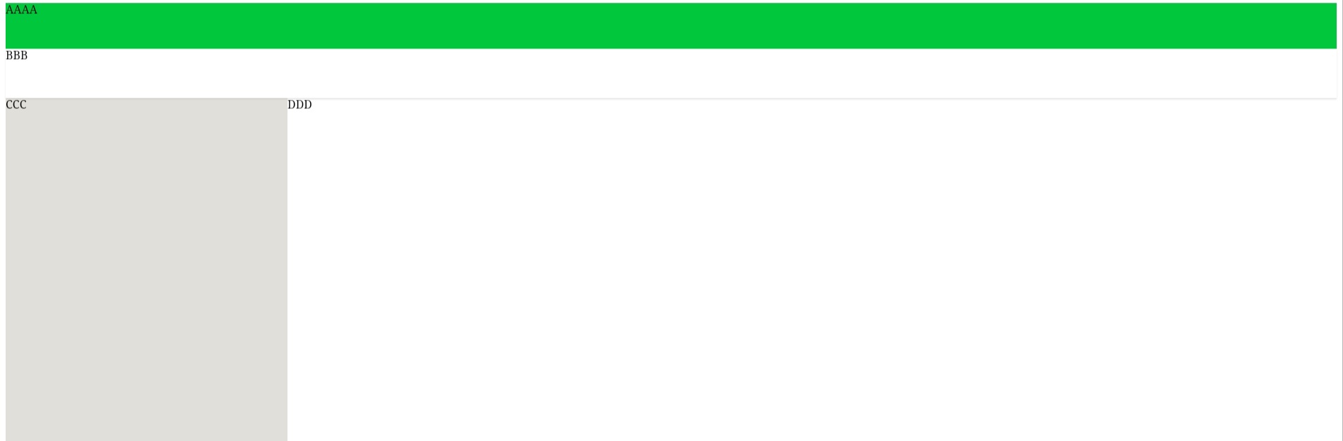
기본예제1 (스크롤롤이 없는 100% 레이이아웃)
html
<div id="wrap" class="wrap">
  <header class="header">AAAA</header>
  <div class="tablist">BBB</div>
  <div class="content">
    <div class="aside">CCC</div>
    <div class="main">DDD</div>
  </div>
</div>
js
html,body{
	height: 100%;
}
.wrap {
    display: flex;
    flex-direction: column;
		height: 100%;
}
.header {
  height: 65px;
  background-color: #00c73c;
}
.tablist {
    height: 70px;
    box-shadow: 0 2px 2px 0 rgba(0,0,0,0.1);
    background-color: white;
}

.content {
    display: flex;
    flex: 1;
}
.aside {
    display: flex;
    flex: none;
    width: 400px;
    background-color: #bfbab078;
}
.main{
    display: flex;
    flex: 1;
    overflow: auto;
}
Leave a comment